How to make Responsive Web Design with Media Query ?
 Tejram Paswan
Jul 30, 2019
2726
1
Tejram Paswan
Jul 30, 2019
2726
1
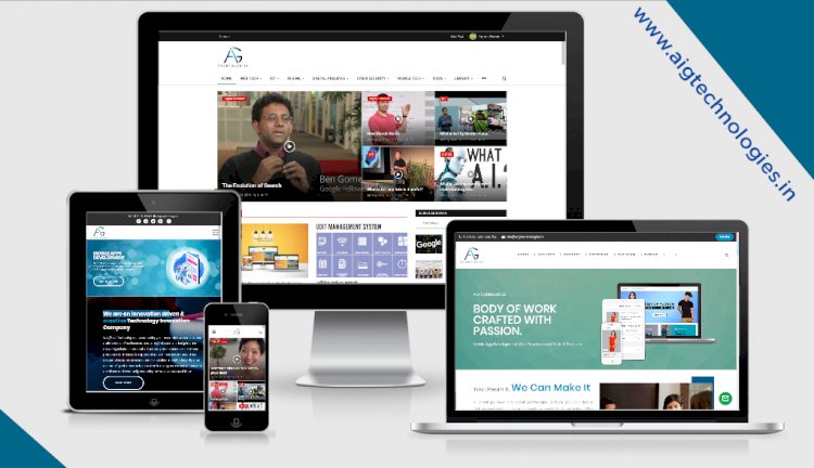
Media Query Responsive Web Design with code.
This is Meta Tag of Mobile View.
Here we have told to you about Media Query, and show of with code. Like this
1- For Small Mobile Devices, when width is (320px to 480px) -
@media (min-width:320px) and (max-width:480px){
/* Here is your CSS code of Mobile View */
}
Here show of through image.

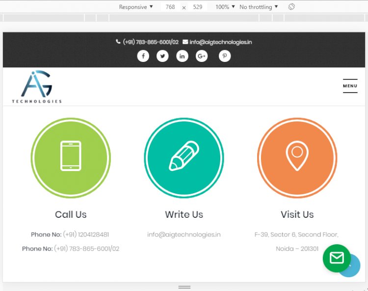
2- For Large Mobile Devices , when width is (481px to 767px) -
@media (min-width:481px) and (max-width:767px){
/* Here is your CSS code of Mobile View */
}
Here show of through image.

Note : - When you want to your div box complete run on Small Mobile and Large Mobile. So follow this code
3- For Mobile Devices , when width is (320px to 767px) -
@media (min-width:320px) and (max-width:767px){
/* Here is your CSS code of Mobile View */
}
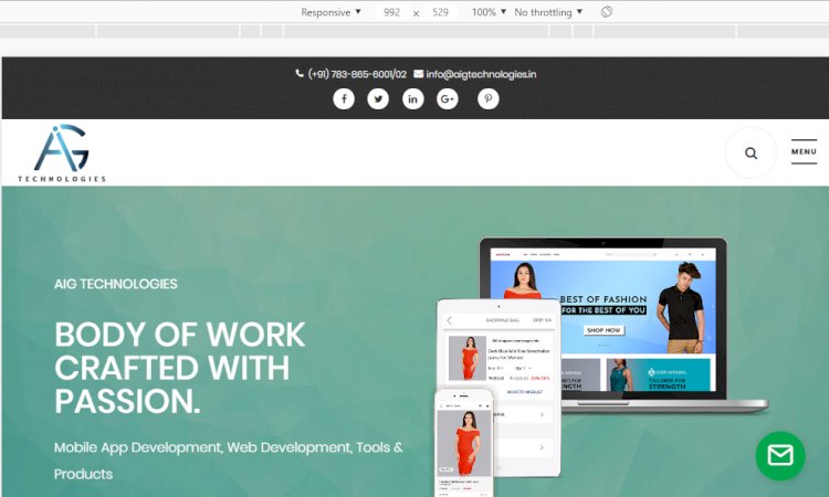
4- For Tablet Devices , when width is (768px to 991px) -
@media (min-width:768px ) and (max-width:991px){
/* Here is your CSS code of Mobile View */
}
Here show of through image.
5- For Large Tablet Devices , when width is (992px to 1200px) -
@media (min-width:992px ) and (max-width:1200px){
/* Here is your CSS code of Mobile View */
}
Here show of through image.
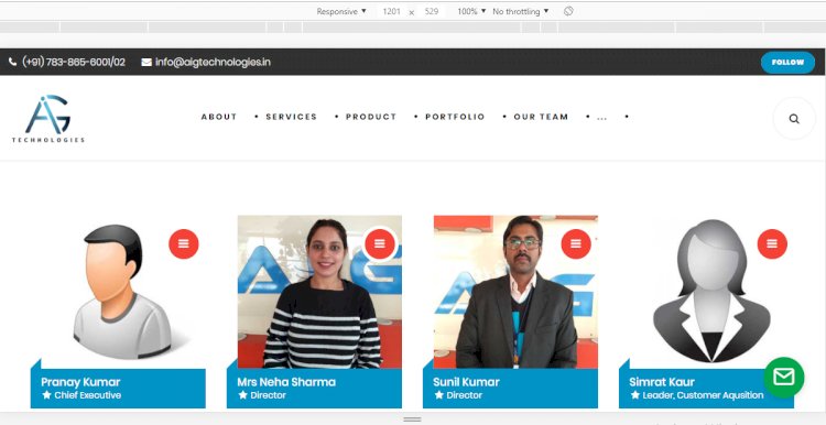
6- For Laptop Devices , when width is (1201px to 1440px) -
@media (min-width:1201px ) and (max-width:1440px){
/* Here is your CSS code of Mobile View */
}
Here show of through image.
7- For Extra Large Devices , when width is (1441px to 1920px) -
@media (min-width:1441px ) and (max-width:1920px){
/* Here is your CSS code of Mobile View */
}
Thanks for Reading


Redwin
good information